
Project: Sarah Lima Traiteur
Date: Oct 2021
My role: Interaction design, visual design, research, strategy

Scenario
Sarah Lima is a Brazilian caterer
based in Paris cooking exquisite
Brazilian dishes for numerous events.
She thinks her website works fine with
things to be implemented to improve
customers experience, and make the
navigation easier and more pleasant
with better visuals.
SARAH LIMA
TRAITEUR
Analyses
Here are a couple of pages from the actual Sarah’s website.
I did some quick notes and analysis on a couple of pages, smartphone and desktop.
They all have good and bad elements to them, here is what I found:

Her logo is clearly a stylish bean, further on, I discovered that some people didn’t get it. Why not use a real black bean since they are not that common in France where most of her clients are not used to see or eat that. Some of them discover it when they eat feijoada for the first time.
Her website is very complete with a lot of pertinent info, but we could indeed make it shorter by simplifying the menu, having it in one language since Sarah doesn’t have enough time to change it and her clients are almost 100% French.
Make some of the info bigger and more readable by changing the typo for example and work on better images.
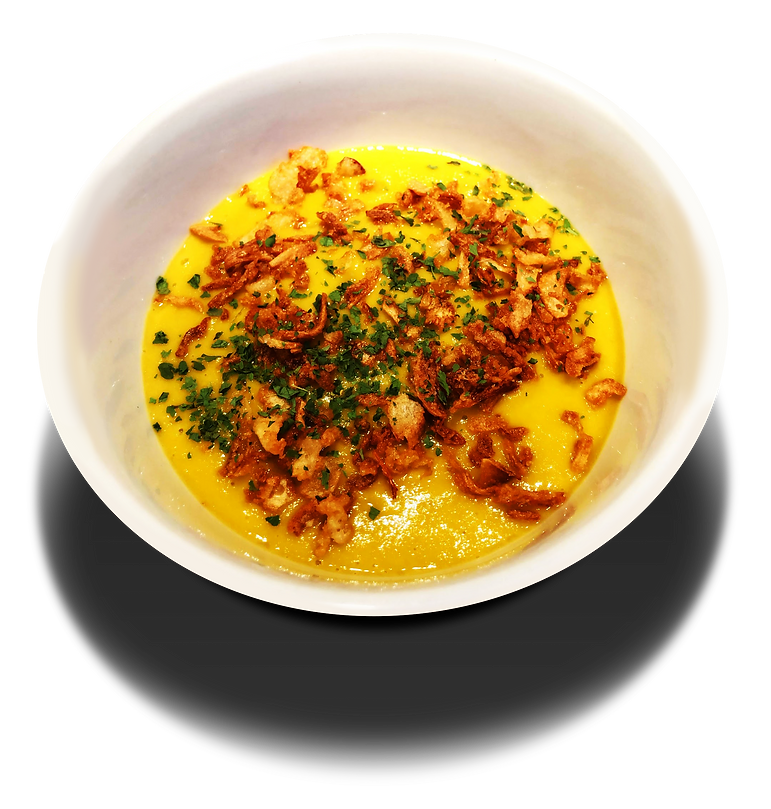
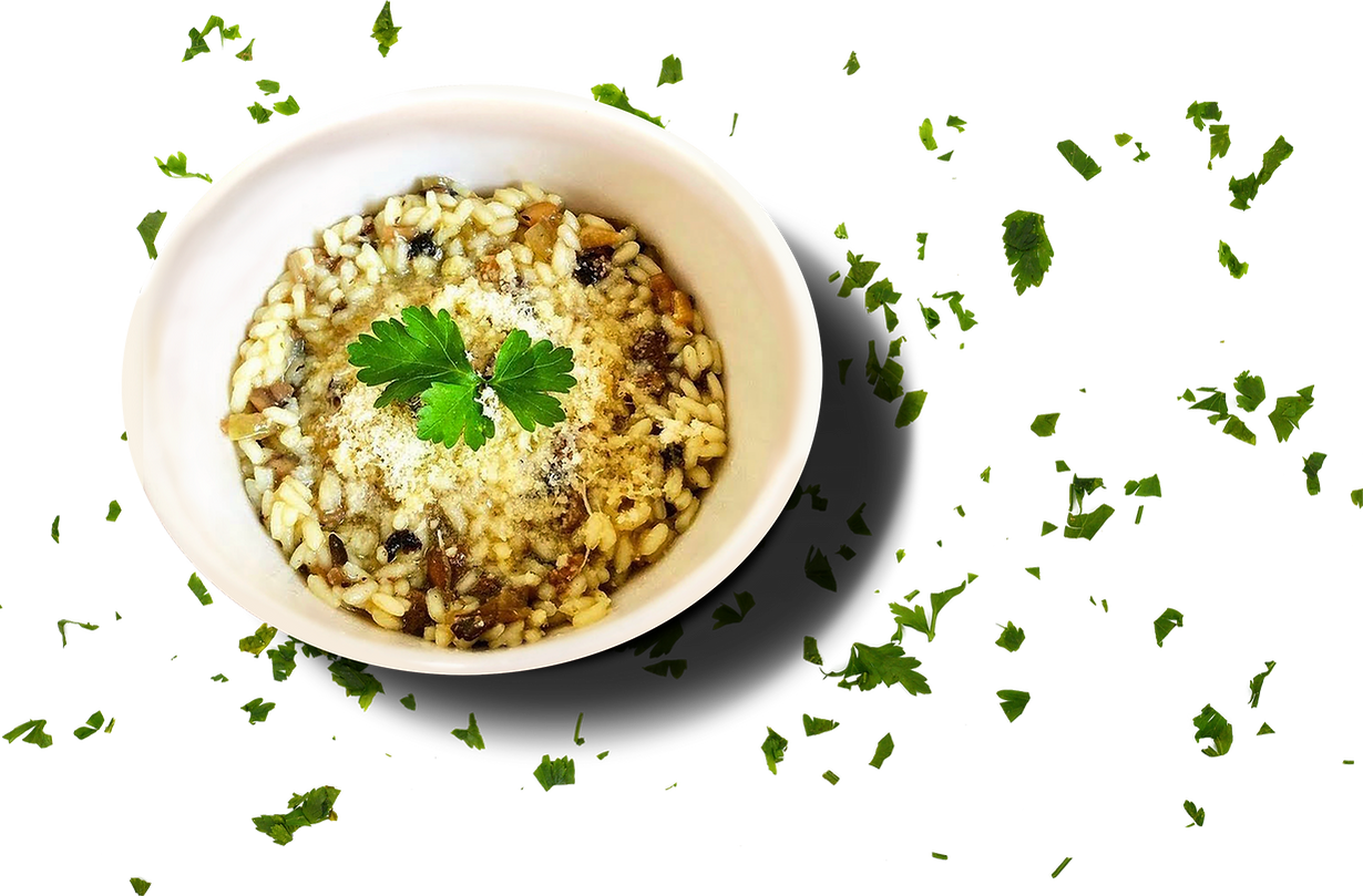
As people associate good images with good food, I thought I could definitely give her a couple of tips
on how to take better pictures to keep them homogenous. A/B testing proved I was right after all.
As most of her clients are companies or big private events, contrary to my expectations, mobile is still their preferred device to order, even if Sarah’s website is still complicated and some info overlap one another.
User interviews
In an interview with Sarah’s customers on her actual site, I collected general insights and functional aspects. Also noticed that we could improve not only her site but some of the services within it.
Can’t find the menu?
Love her logo! What is that?
There are too many info.
Love her Instagram lives, but sometimes I forget them.
Some info are too small and lack contrast.
She proposes three languages in her website,
but the French version is the only one working.
Some buttons don’t work properly.
I always check her website on my mobile,
But it is difficult to find the right info.

Persona
Goals
I intend to create a more modern version of her website, attending to her business goals and client satisfaction.
Help customers to find whatever they need and finish their tasks faster.
Simplify the menus and increase the accessibility and usability.
Simplicity is key, so I won’t change much of its structure since it seems to work well for her customers.
Work on interactive ways to set appointments on people’s agendas.
Sarah had a shop nearby Paris, but due to Covid, she was
obliged to close it and keep on with her activities from home,
and being very active on her website and social media.
Because of that, she has a very intimate relationship with
her customers; she is always on the phone with them,
most of the time she is the one doing the deliveries or
they come to pick it up at her door and for big events,
she is the one following up closely and trying to always be
one step ahead of everything.
She knows that 80% of her orders, come from women
30+ yo, that come to her because they googled
“traiteur brésilien” and she is the first to pop on the page,
or come by word of mouth from someone that have tried it
before or went to one of her events.
On the whole, people land on her webpage,
navigate, call her, explore again, register,
make payment and keep in touch until the D day.
People like keeping it personal.
Based on these info, I could create our persona working side by side with Sarah.
Meet Sabrine, woman, 35 yo about to get married for the first time

Sporty / pragmatic / savvy
Sabrine - Flexitarian
35 yo / female she.her / project manager / engaged.
Sabrine is a mother of two kids who care about nature
and the environment her children will have in the future.
She is a typical Parisian girl and as she is about to
get married for the first time, she forced herself into
a flexitarian diet. She is trying to move to a vegan diet
to prove her family it is possible to live without meat.
Goals
Get to know more about the Brazilian
culinary since her future husband is Brazilian.
Eat properly and have no surprises,
she eats for what she pays for.
Explore the menu and taste new flavours
each time she tries a new restaurant
Pain points
As she is a mother of two, everything
she does in her life has to be optimal.
She wants her family to eat healthy, but
she doesn’t know how to convince them.
She has to deal with the frustration of
putting food in the bin when her kids
don’t eat and she spends money on it.
She prefers to check by herself instead
of checking online reviews.
Too many options makes it hard to
choose, she prefers the emotional and
physical touch.
Ideation
On the ideation process, I’ve decided to use
the law of “if it ain’t broke, don’t fix it”.
I’ve noticed that the website works fine for the kind
of customers she has and people find themselves in it,
so we could only implement a couple of services based
on some of the customer's comments and work on better visuals attending to Sarah’s business needs.
Sarah’s current website has 9 items on the menu bar, and she wanted to keep more or less the same structure. I’ve taken people's comments into consideration and simplified the menu bar to 7 items instead, and if people couldn’t see the menu and phone numbers before, I could give people what they wanted, so I’ve increased these info to make it
visible to everyone.
If some of her clients had doubts about what her logo represented, I’ve decided to make a 3D logo and people will see this is a bean which is one of the basis
of the Brazilian culinary.
Typos and sizes are a big problem in her website as well, so increased it using a more visually interesting typo that will improve visibility to all.
Sarah thought that would be good to have her website in three languages aiming to make her users feel more comfortable reading in the language they prefer,
but she is the one responsible to change all the content and promotions. Doing it in three languages every time is very time-consuming and something that she can’t afford because this is the time she can spend in the kitchen instead. If the majority of her clients are French speakers (60%) and the other big portion that comes to her are English (1%) and Portuguese speakers (39%), why not use the two common languages that are French and Portuguese, like this everyone could find their little pleasure and if they want to speak English they call her directly.
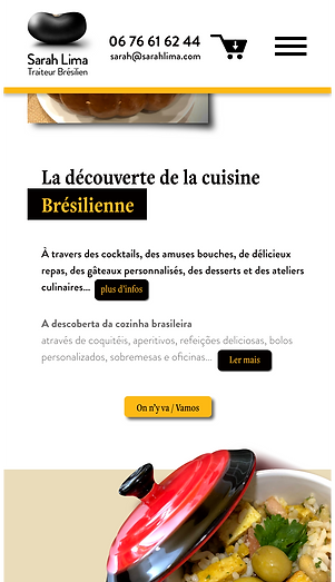
To my surprise, Sarah’s customers come to her using their mobile even if the navigation is not simple and messy sometimes, so I’ve just decided to increase and improve it by organising the menus, using better typo, and better visuals.

Before

Logo evolution
As analyzed previously, I’ve decided to rework Sarah’s logo to make it clear to everyone and make the association with a very common thing in Brazil which are beans, that people eat everyday and Brazilian food from Sarah Lima. This is is how the “gringos” will keep her in mind.
After
Variation
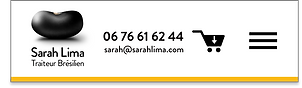
Nav bar
During the process, Sarah wanted to have a big nav bar making her logo and her phone stand out, being the first things that people would see, but the pain point is that we have too many items in the menu bar. People understand what is behind each section of the menu, but too much info is confusing. keeping consistency is key since she is making slight changes and we didn’t want people to be lost while navigating on desktop and mobile.
Previous Desktop version
How Sarah wanted to see her nav on a desktop
Proposal with less items

Previous mobile version

Proposed version
Site desktop
Sarah is the one responsible for the changes on her website, so I had to simplify things and avoid making complicated pictures that she won’t be able to change by herself.

Site mobile
A responsive design where the nav was simplified compared to the previous version and bigger info helping users to find info easier.


Notification
Sarah’s clients like following up with her lives on instagram, but with the hustle and bustle, they end up forgetting about it.
The idea was to include one button where people could see the lives they are interested in the month, subscribe directly on her site and receive notifications accordingly to their demands.


Takeaway
Accordingly to Sarah’s users that saw the prototype,
things were way more clear and easy to use. Images were more appealing and suggestive mainly when people
were hungry.
As Sarah is alone in the company, she has to deal with all the changes on her own but cooking, dealing with paperwork, taking care of kids and household is vet time demanding.
She is willing to make those changes but the whole process takes time.
This project gives me an understanding that how difficult it is to introduce a small new feature into a company, small, medium, or big, no matter the size of the changes, it is always difficult to implement something new.
This project was done side by side with Sarah Lima
that was giving hints on how her clients work within her website. The changes pleased her, responding to
her business needs and clients request making the experience faster and more engaging.