
Project: Solutions 30
Date: Sep 2022
My role: Usability audit, documentation and areas of improvement, Ideation workshop, prioritization, sketching, quick win mockups.

CONTEXT
Solutions 30 is the preferred partner when it comes to implementing and providing assistance for new technologies. It gives digital support solutions to end-clients, both individuals and professionals, mostly on behalf of larger telecom and digital OEM companies.
Today, Solutions 30 is the market leader in Europe, and with more than 15,000 service engineers, handling more than 75,000 service calls per day, available in ten European countries, they provide one-stop-shop solutions for their clients’ everyday problems. Their five main insdustries are: telecommunications, IT, security, energy, and retail.
PROBLEM
The request didn’t come directly from Solutions 30 but from one of Orange’s third part companies in the south of France. They have worked on an app for one of their clients called "Circet", where they have presented and their client loved their proposals, but they also had Solutions 30, which is one of the main competitors and they sold the same app with the same services to both clients. Dumb or smart move, you name it, but the fact is that both clients could not know the apps Orange’s third part company was developing were similar to one another, so they requested Orange OBS services to help them to rework the solutions 30 app, based on an app they were currently working on and make it differ from one another. This is how I jumped in and you can imagine how tricky it was because I couldn’t change much of the UX and UI, and it has been sold to their client already and the dev team was working on it.
When this company approached Orange OBS, my managers sold them a mini UI kit and 4 desktop and mobile pages, and the rest was supposed to be done by their dev team. After analyzing how complex their work was, I had to jump in, have a chat with the client and change a couple of things on how I should deliver this work. Here you can see some of the pages they have done for "Circet" and these were the pages I was supposed to base my work to create new ones.
Desktop version


Mobile version


USABILITY AUDIT
After digging into the mobile and desktop pages, I gave the documentation to the client and explained what I found in terms of UX and UI.
Overall, their pages were straightforward with not much to see because these are service pages with not many functionalities.
In terms of UX, the app lacks consistency between the pages, and the user journey is way too complex presenting pages that the user feels locked in it,
with no way to go back forcing them to restart the process. There are too many pages that look alike confusing the user. There’s some work to be done in the copy as well to make the info clear to the user.
The user journey has to be reworked to avoid having extra pages for no reason. The back buttons need to work better guiding the user to the homepage and not halfway.
In terms of UI, There’s a need to unify and use fewer colors, making it more intuitive and user-friendly with easy-to-identify and easy-to-use buttons. Sometimes we have an entire page for one button.
Icons play a very important role in this website and they should be taken care of, along with images to illustrate what the user may be looking for.
IDEATION / PRIORITIZATION / SKETCHING
At the beginning of the process, they didn’t envisage an ideation workshop, but it was necessary because, within the process, the client changed their mind several times about having a proper UX study
done before attacking the UI, organizing a catch up with their client “solutions 30”, but it wouldn’t be posible because their clients could not know about this other app that was done for Circet, their dev team agreed
with everything i’ve reported but the PO was in disagreement with the work done by the dev team and the and from the PO’s point of view, we should restart from scratch, but the project manager didn’t agree
with everything the PO had in mind.
We had an imposed deadline, and the budget this Orange third part company had wouldn’t be able to cover all the methodology and time we were supposed to spend on it.
The PO didn’t have all the answers to my questions, so we decided to organize a 2 step ideation workshop. As we couldn’t change much in terms of UX and UI, but the change was necessary, we had a first
meeting with the PO and the dev that worked on the desktop version, and a second meeting with the PO and the dev that worked on the mobile version, because it was impossible to have both at the same day.
At this stage we had lost too much time, so i decided to work on the priorization and sketching workshop within the ideation process.

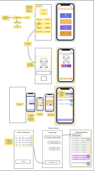
PROTOTYPING
Sometimes the quick and dirty can work very well when we are on the clock. The initial deal was to work on 4 desktop and mobile pages and a UI kit in 4 days, but I felt I should give them more because
the team was struggling already. At that time of the process,
I didn’t have any guidelines from the client, so I pushed to have a quick chat with "Solutions 30" and ask for whatever they had to give me,
so they gave me a brand book with not a lot of info that could be useful to me at the time. Well, some are better than none!
I could use their colors to create a color palette, create a mini design system with their typo,
a couple of buttons, and icons. They had some but they were completely different from one another. I could also have access to a couple of pictures from their image bank.

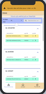
Desktop version


Mobile version


CONCLUSION
As mentioned previously, at the beginning my job was to create a mini Ui kit and 4 desktop and mobile pages in 4 days, but I managed to do more with the time and budget the client had within Orange.
The client was super happy because they were completely lost, and I managed to help them in a way their dev team could move on with the work differentiating from the original app they’ve previously sold to their
other client. I personally felt good because they can now move faster because I worked hand in hand with the client, and we could move faster. They were happy and now the project manager and the PO, seem to have an agreement on the pages. My client called me a couple of days later to tell me they’ve presented to their client, "Solutions 30", and they loved it all, just asked for a couple of changes in the process
on how their users may approach the services, but in general, it was enough for them to start talking about production.